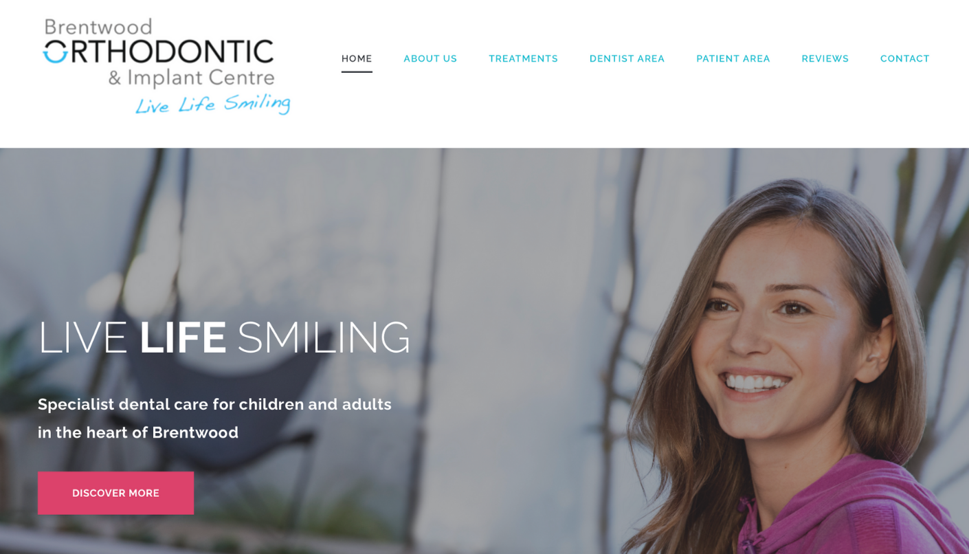
In 2018, we were appointed to take charge of Brentwood Orthodontic Centre’s rebranding project, alongside the very talented Attract & Engage. Our client wanted to move away from the drab `waiting room` style you usually see when visiting a medical brand’s site – and they entrusted us to craft a fresh design for them.
Client: Brentwood Orthodontic Centre
REBRANDING + BRAND DEVELOPMENT
The brief: A smart, friendly, approachable website
BRAND NEW WEBSITE
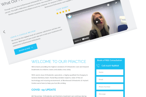
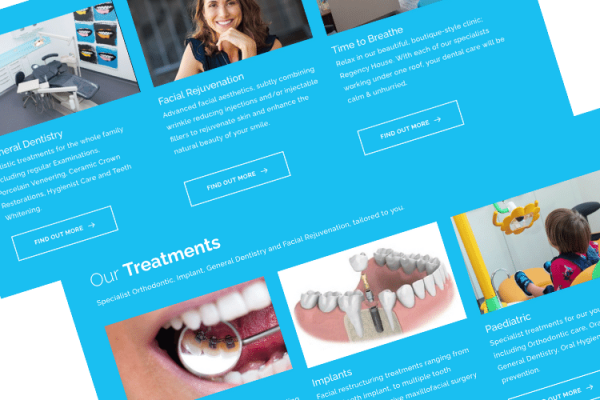
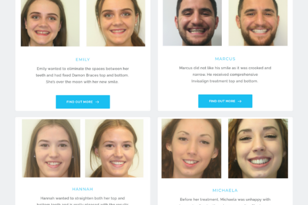
Whilst Attract & Engage worked their magic on the on-site copywriting, our creative team injected a little youth and a lot of sophistication into the front-end. We know customer behaviour is affected by colour schemes, so that’s exactly where we started. First, we took Brentwood’s gorgeous fresh blue in their logo and used it across other areas of the site design: within the banners, main navigation bar, call-to-actions, and h-tags. We avoided the traditional medical greys and whites, which we knew would transform the site’s feel from cold and clinical to smart and friendly. Next, we added lots of multimedia – such as clear, professional imagery and video – to keep web visitors engaged and to help prolong web sessions.


